Next time you go for a walk through your neighborhood, make a list of every place where food is grown or provided and where it’s not, such as the 20-block stretch that has no grocery store or food asset. People here have to walk a long way for a cup of coffee or fresh vegetables. Now transpose that list onto a map of the area. That long walk now appears as a food desert. This is a food asset map—a pictorial representation of where food is available and, more importantly, where it’s not.
Food maps can show the locations of all the food banks in a region to more specific food assets such as fruit-bearing bushes and trees found along your street.
In the village of Lumby, in B.C.’s North Okanagan Valley, the non-profit Land to Table worked with the local government to create a food asset map to determine if or how village-owned agricultural land could be turned into a community food asset. “Based on mapping out what the community has, we could see what is missing,” says Liz Blakely, the group’s executive director.
Increasingly used by nonprofits and city planners, food maps paint a hard-to-ignore visual depiction of an area’s access to food.
Connecting dots and people: Vancouver Food Asset Map
“A food asset map gives us more information about what’s going on or available in neighborhoods,” says Ian Marcuse, coordinator of Vancouver Neighbourhood Food Networks (VNFN), a non-profit organization promoting food security throughout the city and the group responsible for current updates to the Vancouver Food Asset Map (FAM).
The FAM depicts nearly 1,000 assets, ranging from urban farms, community orchards, and gardens to food assistance programs, school breakfast programs, and grocery stores.
“When we reach out to assets, it also builds relations,” says Marcuse. These interactions not only help maintain the accuracy of the map but also open the door for new resources, such as Indigenous food programs that make food systems more inclusive.
Take Action
Create your own food map.
Elvira Chan is the partner engagement coordinator for the Vancouver Divisions of Family Practice, a non-profit organization whose goal is to support physician members and advocate they receive the necessary tools to look after patients. Chan recently contacted the VNFN about food maps. “Doctors,” says Chan, “don’t always know what is out there and available to them.” A map, as part of a larger resource package doctors can disseminate to patients who are looking for healthy eating options or who have expressed food security concerns, is a useful tool, she says.
Food Stash, a not-for-profit Vancouver-based food recovery program, also finds the map a valuable resource tool.
“We get emails, phone calls and people onsite every day looking for food. We keep a running list [based on the asset map] of programs we know have space or are a low-cost option while people are put on a waitlist,” says Anna Gray, communications coordinator.
Available for anyone to access through the VNFN’s website, since the FAM became available to the public in 2017, it has accumulated more than 400,000 views.
Feeding America: Map the Meal Gap
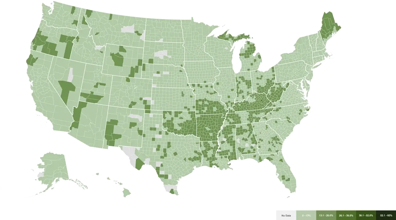
Map the Meal Gap was created in 2011 by Feeding America, the largest charity dedicated to ending hunger in the United States. This map provides an in-depth, visual representation of food insecurity across America showing a county-by-county breakdown of food access highlighting barriers to nutritious food and how much funding and meals are needed to close the gap between those who have enough to eat and those who don’t.

Groundbreaking in 2011, the map is updated annually with data transcribed from government census reports and sources such as the USDA. But why a map when a written report would provide similar information? “We wanted a visual,” says Emily Engelhard, vice president of food security and well-being research and insights. “We wanted to have a tool that anyone could click onto in their state and county and play around with to see how food insecurity looked different in their community compared to another.” Food insecurity, as Engelhard notes, is found in every state and every county of the US. In 2023, for example, 13.5 percent of all US households experienced some level of food insecurity.
Read More
From Community, For Community: The Rise of the Free Fridge: Community fridges have been around for more than a decade. Why has this form of mutual aid become so popular?
To gauge the effectiveness of the map, every year, Feeding America sends out a survey to food banks in its network. Seventy-five percent of food banks that respond report using the MMG “often” or “always” to allocate resources effectively.
From Oregon Food Bank’s five main locations, food is distributed to communities across Oregon and Southwest Washington State. In 2023, there were 1.9 million visits to food assistance sites within the network—a 14-per cent increase over 2022.
“The map,” says Morgan D. Dewey, media and engagement manager, “also helps highlight that food insecurity disproportionately impacts particular communities—such as Black, Indigenous, and Communities of Color; immigrants and refugees; single moms and caregivers; and trans and gender-expansive individuals—regardless of geography.”
By addressing these disparities, the map becomes an essential tool in ensuring everyone has access to resources.
Ohio maps that tell an artful story
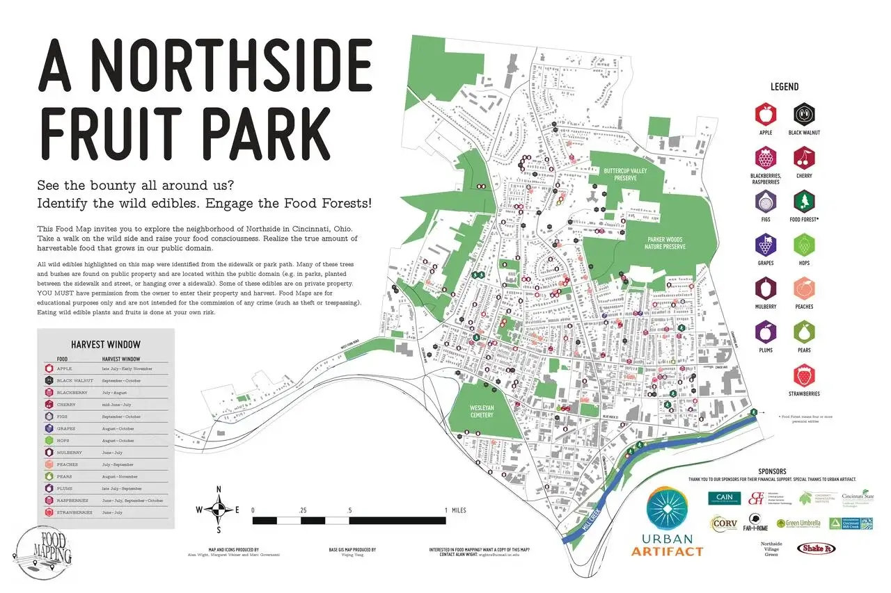
Alan Wight is the community and school forest garden liaison at the University of Cincinnati. In his spare time, he works with organizations such as Eat Local Central Ohio River Valley (CORV) to help community organizations create food maps.
Food maps to Wight are a form of art. Inspired by Situationist International, a mid-20th-century movement that used the concept of mapping to change the way people think about the spaces around them, Wight hopes the food maps he facilitates create an artful expression and a new way for a community or groups to appreciate the local food system around them.

Creating a map is a year-long process that begins by talking to community stakeholders about what they’d like represented on the map. “Sometimes, it can be as simple as the convenience stores and grocery stores or as detailed as where the fruit and nut trees are growing,” says Wight.
Small groups are formed to walk through neighborhoods documenting these assets.
The first map Wight helped a community create was of Camp Washington, a Cincinnati neighborhood. Depicting convenience stores, restaurants, community and school gardens, meat-processing and packaging facilities, the map is an artful display of logos that guides the user through a labyrinth of food assets.
Downloadable from the Eat Local CORV website, Wight says that the maps are often made into posters and displayed at community centers and other neighborhood gathering spots. But, as far as he is concerned, how they are disseminated is secondary. It’s the community engagement in designing the map that to him is the biggest benefit.
“It’s the process,” he says. “What comes out of the discussions lives much longer than the map.”
Learn More
City Planning for Food Security in the Face of Climate Change: Climate change negatively impacts food security. A reader wrote in asking how their city could plan for it.